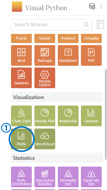
5. Plotly
Select Plotly in the Visualization category.
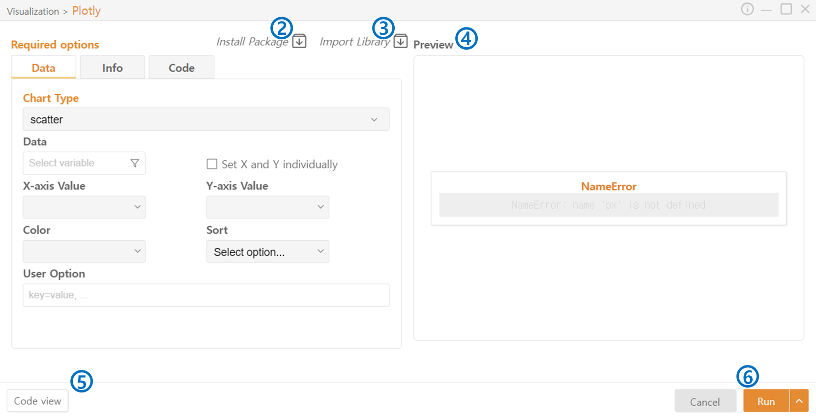
Import Package: Install the necessary packages(Plotly) for code execution.
Import Library: Import the libraries required for code execution.
Preview: Preview the chart that will be generated.
Code View: Preview the code that will be generated.
Run: Execute the code.
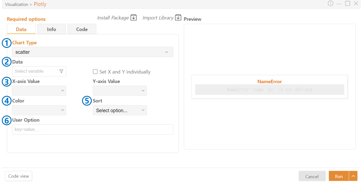
Data
Chart Type: Select the type of chart.
Data: Choose the data to be represented in the chart. You can also select a specific column of a DataFrame through the Funnel Icon. Set X and Y Individually allows selecting data from different DataFrames.
Axis Value: Select the data to be used on each axis.
Values (Pie Chart): Choose the data to represent the size of each section in a Pie Chart.
Names (Pie Chart): Choose the data to represent the names of each section in a Pie Chart.
Parents (Sunburst): The Sunburst chart represents hierarchical data in a circular form. Select the data indicating which parent section each segment belongs to.
Color: Enable the use of color and choose the color of the graph.
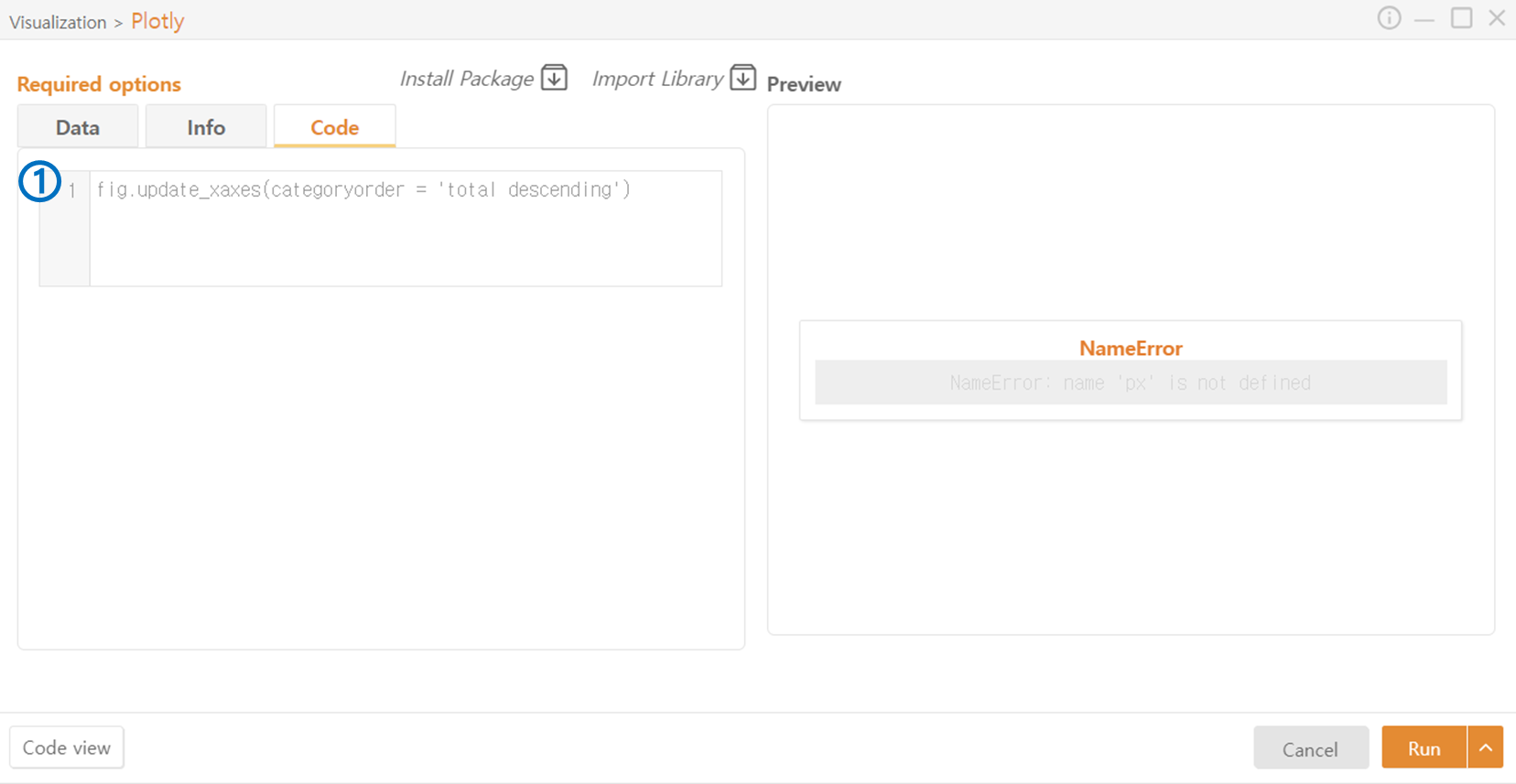
Sort: Specify the order of categories on the X-axis. Descending arranges columns from the highest to the lowest amount of data.
User Option: Optionally provide additional desired options.
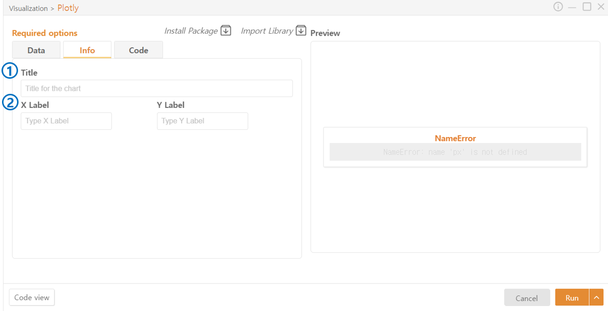
Info
Title: Specify the title of the chart.
Label: Specify the names of each axis.
Code
Additional code beyond the functionalities provided by Visual Python can be added.
Last updated