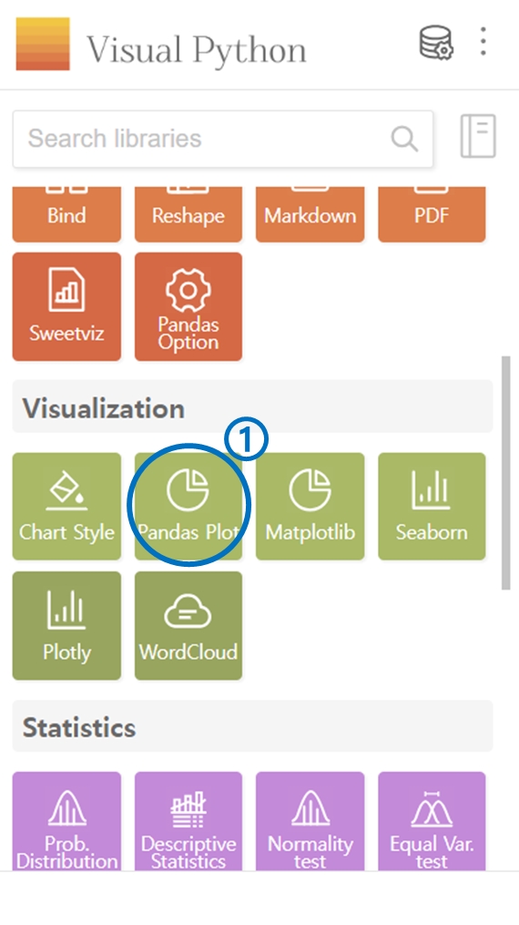
2. Pandas Plot
Click on Pandas Plot in the Visualization category.
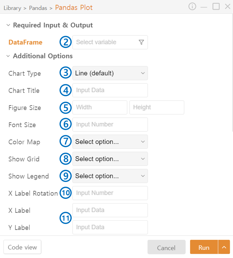
Select the DataFrame to be represented as a plot.
2-1. Specific columns of the DataFrame can be selected using the funnel icon.
*The following items will be set to default values if not entered:
Choose the Chart Type.
Enter the Chart Title.
Input the size of the output plot.
Select the Font Size of the text on the plot.
Select the color theme for the displayed plot.
Decide on the visibility of the Grid.
Decide on the visibility of the Legend.
Rotate on the axis names if needed, especially useful for long names.
Specify the axis names.
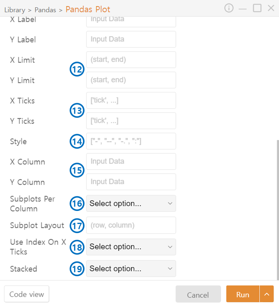
Set the range of values to be displayed on the axes.
Specify the interval between axis tick marks.
For line graphs, specify the style of the lines.
Choose the columns from the DataFrame to be represented in the plot.
Simultaneously, create multiple plots within a single figure.
Specify the Layout when creating multiple plots.
Choose True if you want to use the DataFrame's index as the X-axis.
If True, represent data from multiple columns of the DataFrame in a single plot.
Last updated