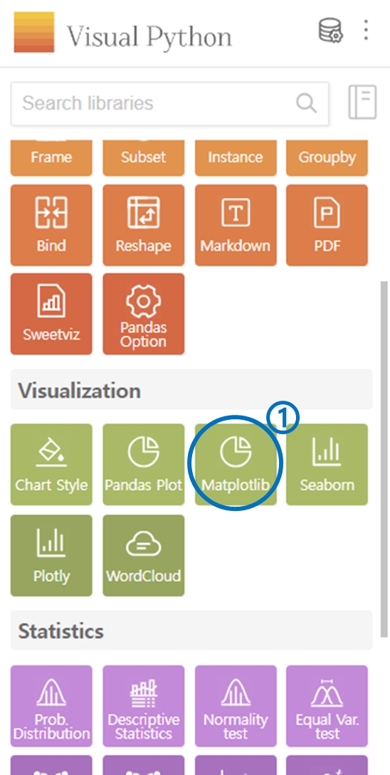
3. Matplotlib
Select Matplotlib from the Visualization category.
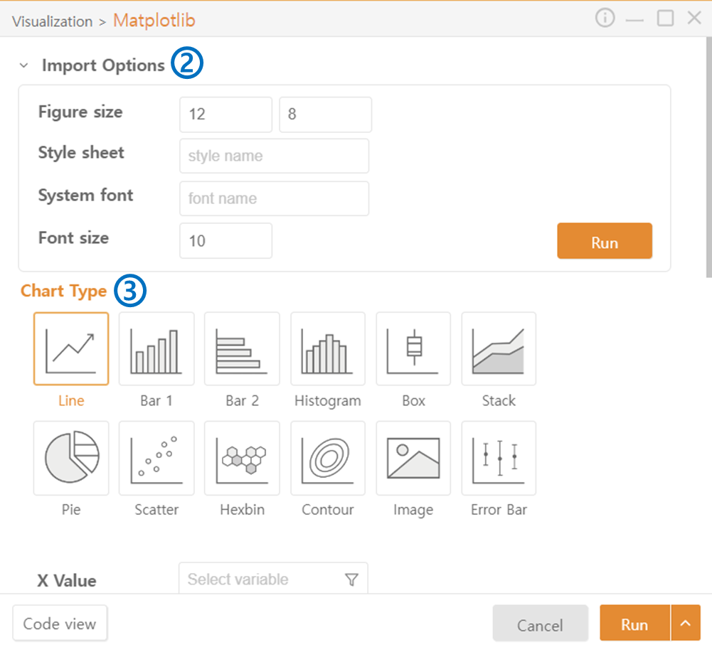
Configure the default settings of the Figure through Import Options. Detailed settings can be done in the Chart Style of the Visualization category.
Choose the Chart Type.
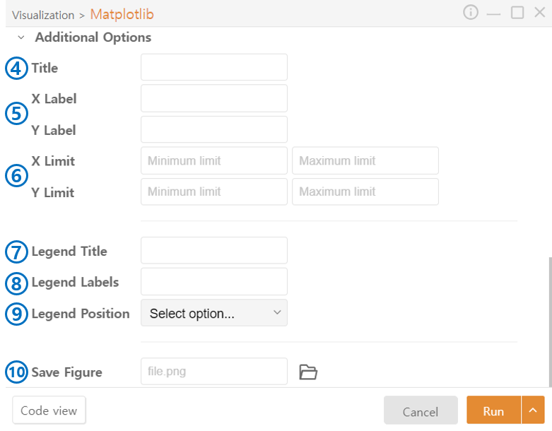
*Additional Options: The following options exist universally for all chart styles.
Title: Enter the title of the FIgure.
Label: Set the name of the axes.
Limit: Set the range of values to be displayed on the axes.
Legend Title: Enter the title of the legend.
Legend Labels: Add labels to the legend to explain the meaning of each plotted data.
Legend Position: Choose the position of the legend.
Save Figure: Save the figure. Set the path using the file-shaped icon.
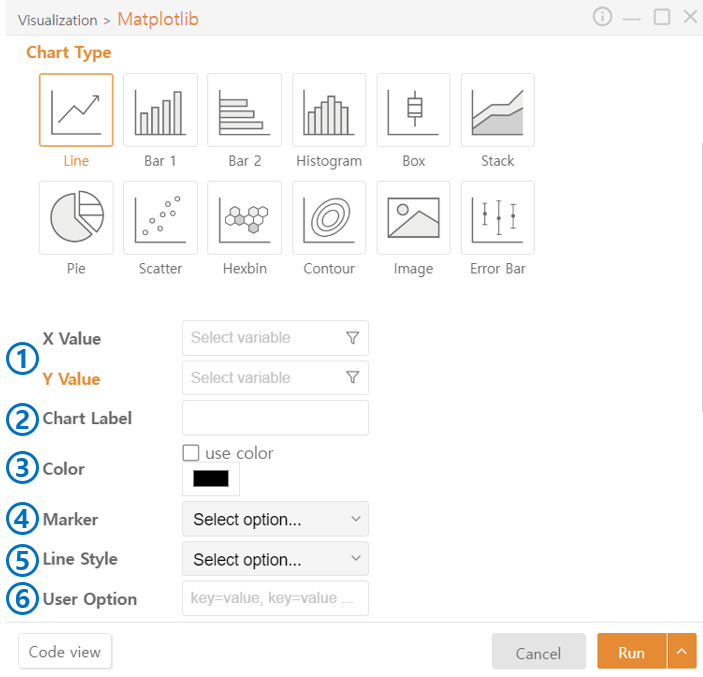
Line Plot
Value: Select the data to plot. You can choose a specific column from a DataFrame using the funnel icon.
Chart Label: Add labels to explain the meaning of each plotted data.
Color: Check Use Color and choose the color of the graph.
Marker: Choose the style of the marker.
Line Style: Choose the style of the line.
User Option: Additional code beyond the functionalities provided by Visual Python can be added.
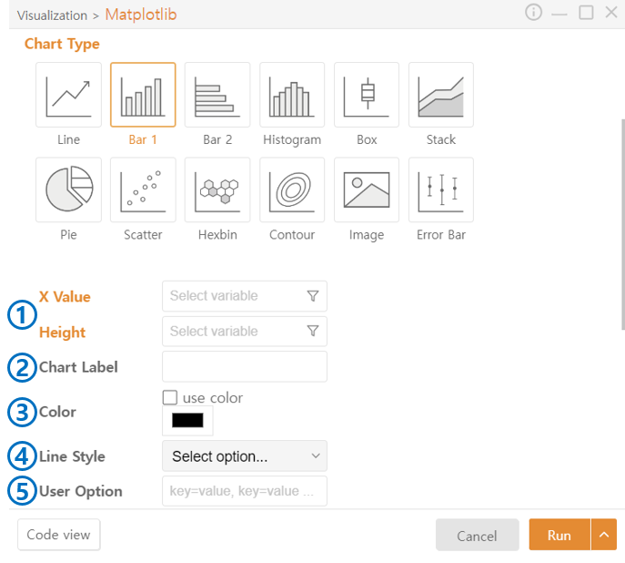
Bar Plot 1
X Value, Height: Select data to plot. You can choose a specific column for a DataFrame using the funnel icon.
Chart Label: Add labels to explain the meaning of each plotted data.
Color: Check Use Color and choose the color of the graph.
Line Style: Choose the style of the line.
User Option: Additional code beyond the functionalities provided by Visual Python can be added.
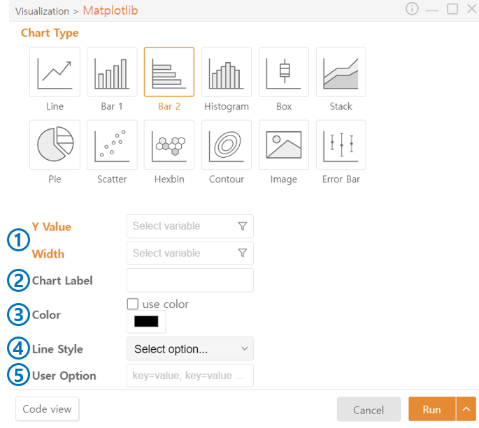
Bar Plot 2
Y Value, Width: Select data to plot. You can choose a specific column from a DataFrame using the funnel icon.
Chart Label: Add labels to explain the meaning of each plotted data.
Color: Check Use Color and choose the color of the graph.
Line Style: Choose the style of the line.
User Option: Additional code beyond the functionalities provided by Visual Python can be added.
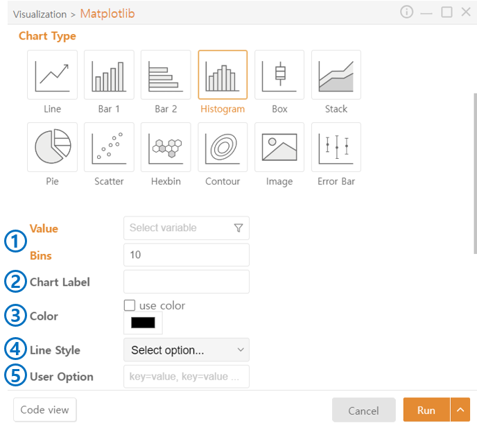
Histogram
Value: Select data to plot. You can choose a specific column from a DataFrame using the funnel icon.
Bins: Set the intervals (bin size) to divide the data.
Chart Label: Add labels to explain the meaning of each plotted data.
Color: Check Use Color and choose the color of the graph.
Line Style: Choose the style of the line.
User Option: Additional code beyond the functionalities provided by Visual Python can be added.
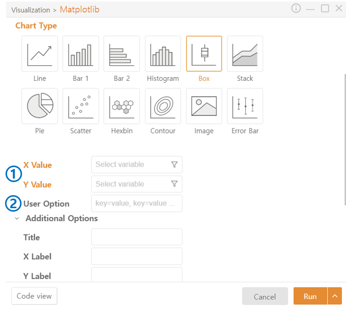
Box Plot
Value: Select data to plot. You can choose a specific column from a DataFrame using the funnel icon.
User Option: Additional code beyond the functionalities provided by Visual Python can be added.
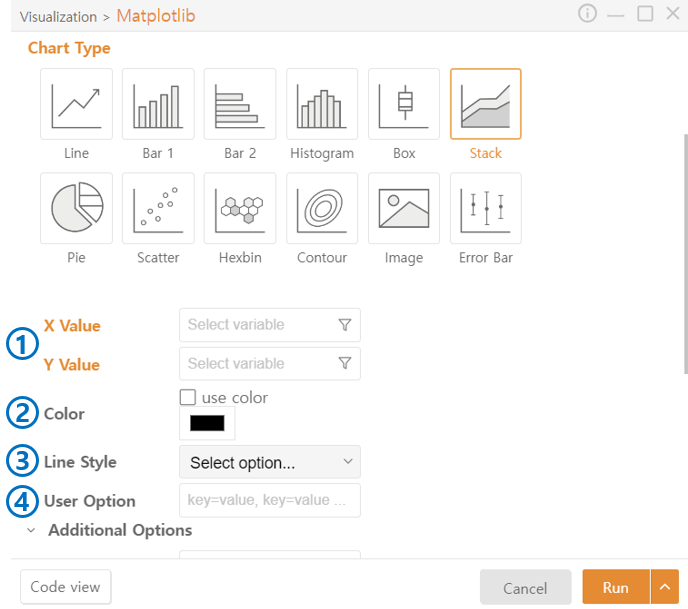
Stack Plot
Value: Select data to plot. You can choose a specific column from a DataFrame using the funnel icon.
Color: Check Use Color and choose the color of the graph.
Line Style: Choose the style of the line.
User Option: Additional code beyond the functionalities provided by Visual Python can be added.
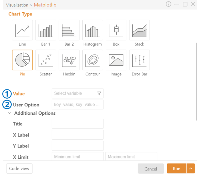
Pie Plot
Value: Select data to plot. You can choose a specific column from a DataFrame using the funnel icon.
User Option: Additional code beyond the functionalities provided by Visual Python can be added.
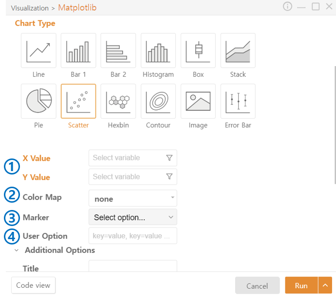
Scatter Plot
Value: Select data to plot. You can choose a specific column from a DataFrame using the funnel icon.
Color Map: Choose the color theme to map to the data.
Marker: Choose the style of the marker.
User Option: Additional code beyond the functionalities provided by Visual Python can be added.
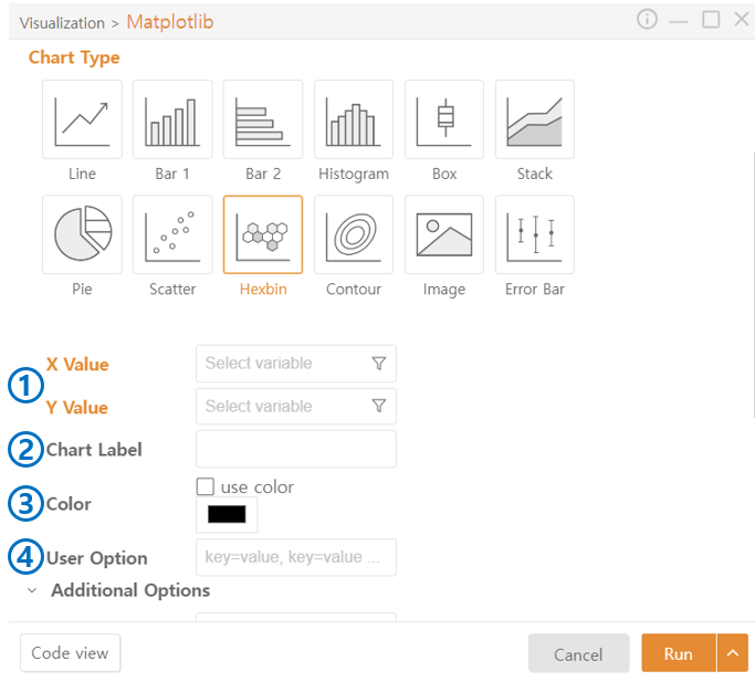
Hexbin
Value: Select data to plot. You can choose a specific column from a DataFrame using the funnel icon.
Chart Label: Add labels to explain the meaning of each plotted data.
Color: Check Use Color and choose the color of the graph.
User Option: Additional code beyond the functionalities provided by Visual Python can be added.
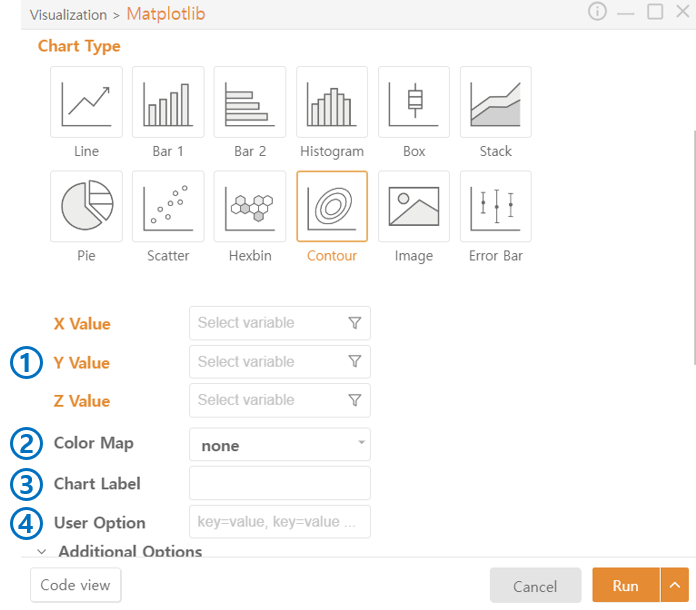
Contour Plot
Value: Select data to plot. You can choose a specific column from a DataFrame using the funnel icon.
Color Map: Choose the color theme to map to the data.
Chart Label: Add labels to explain the meaning of each plotted data.
User Option: Additional code beyond the functionalities provided by Visual Python can be added.
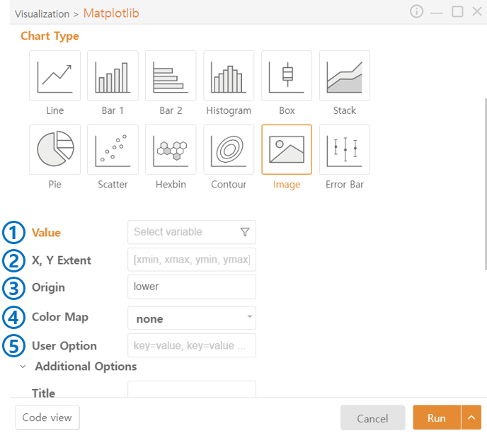
Image Plot
Value: Select data to plot. You can choose a specific column from a DataFrame using the funnel icon.
Extent: Specify the range on the X and Y axes where the image will be displayed.
Origin: Choose the position of the image's origin. Lower places it at the bottom of the coordinate plane, and Upper places it at the top.
Color Map: Choose the color theme to map to the data.
User Option: Additional code beyond the functionalities provided by Visual Python can be added.
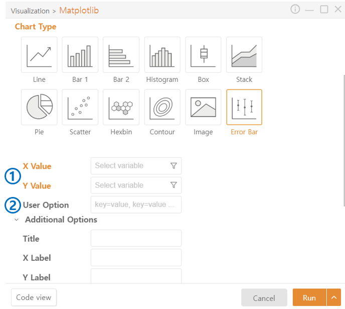
Error Bar Plot
Value: Select data to plot. You can choose a specific column from a DataFrame using the funnel icon.
User Option: Additional code beyond the functionalities provided by Visual Python can be added.
Last updated