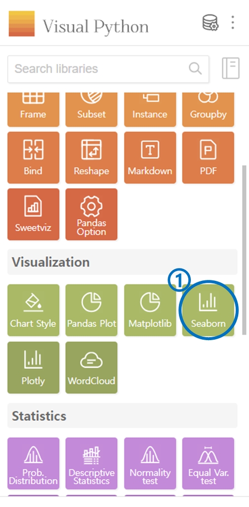
4. Seaborn
Click on Seaborn in the Visualization category.
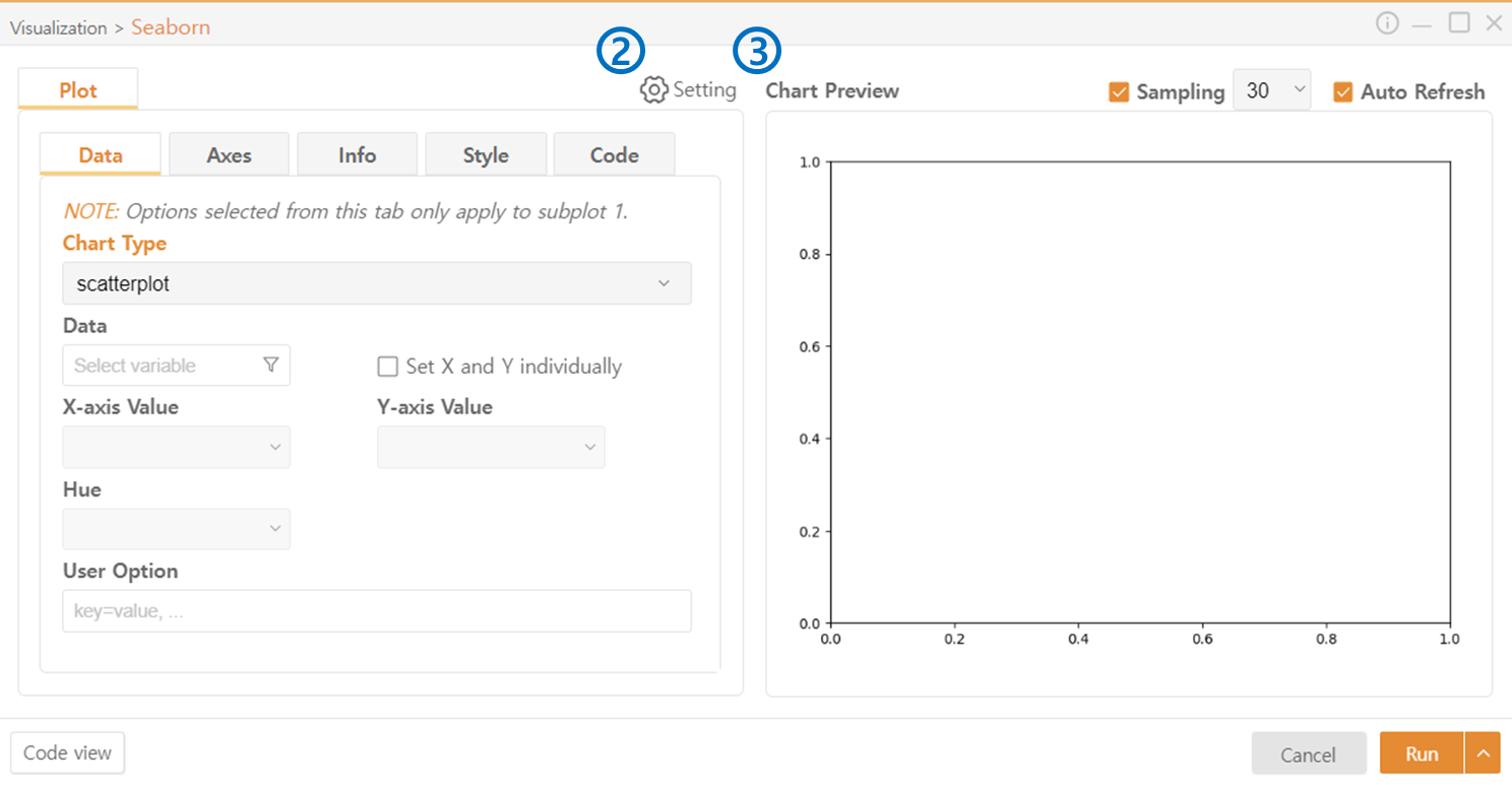
You can use Settings to set the basic style of the plots displayed. For detailed configuration, use the Chart Style in the Visualization category.
You can preview the plot to be displayed. In the top right corner, you can set the number of samples used for preview.
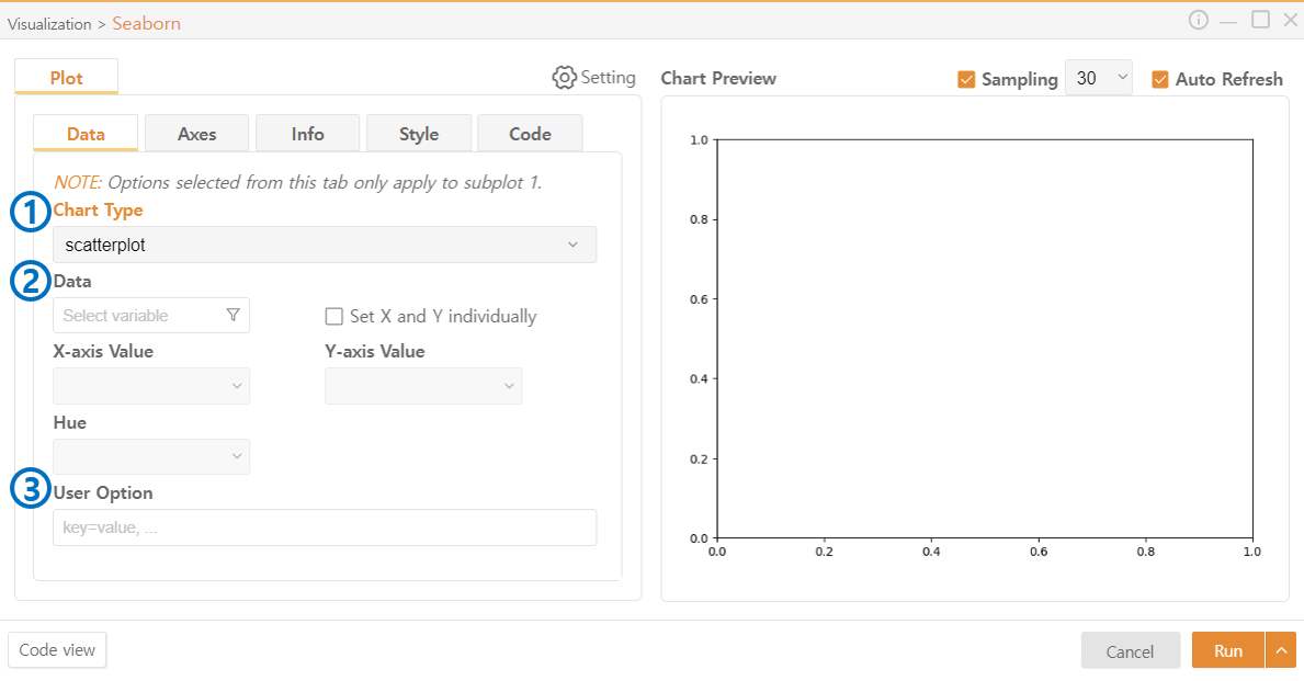
Data
Choose the style of the chart.
Data: Select the data to be represented in the plot. You can use the Funnel Icon to choose specific columns from the DataFrame. Check Set X and Y individually to select the data separately for each axis.
User Option: Optionally provide additional desired options.
*The manual provided below may or may not exist depending on the type of chart.
Hue: Further segment the data already selected for display based on another column or data. The data will be displayed in different colors based on the new criteria.
Bins: If the data you want to represent in the graph(Histogram) is continuous, you can express it by dividing it into a certain number of intervals. It will be represented by bars divided into a specified number of intervals.
KDE(Kernel Density Estimation): To smooth the shape of the graph(Histogram), use a density plot format.
Stat: Choose the meaning of each bar in the graph(Histogram). For example, if you choose the 'Count', the height of each bar represents the number of data points in that interval.
Orient: Choose the direction of the graph(Bar Plot).
Annot: Choose whether to display data values in each cell of the graph(Heatmap).
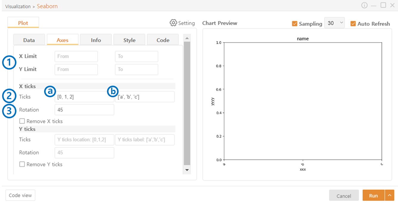
Axes
Limit: Defines the range of data to be represented on the X and Y axes.
Ticks: Sets the ticks on the X and Y axes.
(a) Specifies the positions where ticks will be displayed in the following format:
[0, 1, 2, 3] -> Four ticks will be drawn.
(b) Sets the labels (Characters or Numbers) to be displayed as ticks in the following format:
['a', 'b', 'c', 'd'] -> The specified values will be displayed in order as ticks.
Rotate: Rotates the ticks by the specified angle. Useful when text overlaps.
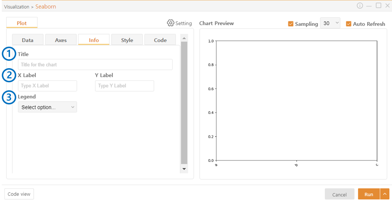
Info
Title: Sets the title of the plot. The name is placed at the top center of the plot.
Labels: Sets the names of the X and Y axes.
Legend: Sets the position to display the legend.
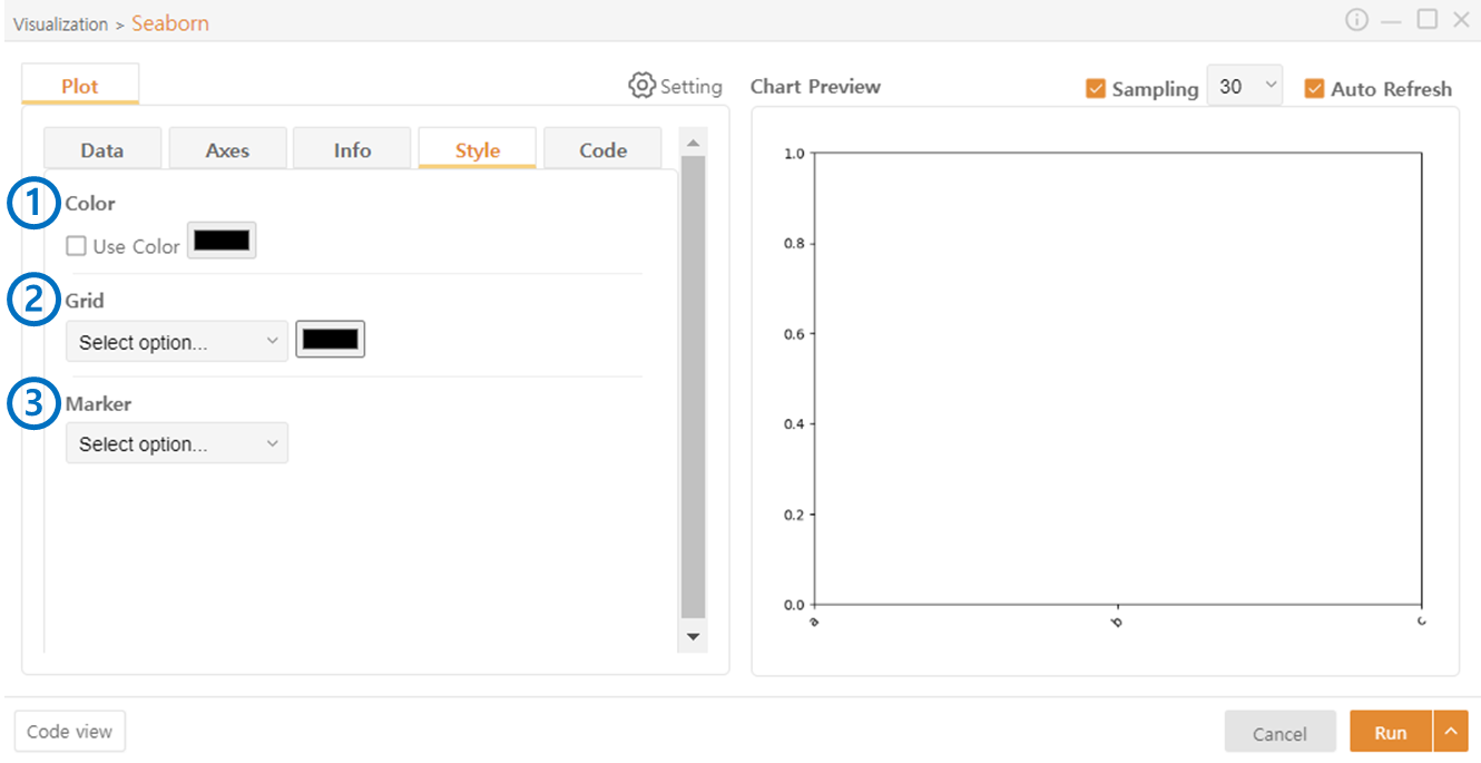
Style
Color: Enable the use of color and allow you to choose the color of the graph.
Grid: Select whether to use a grid. Color can also be assigned.
Marker: Choose the style of the marker.
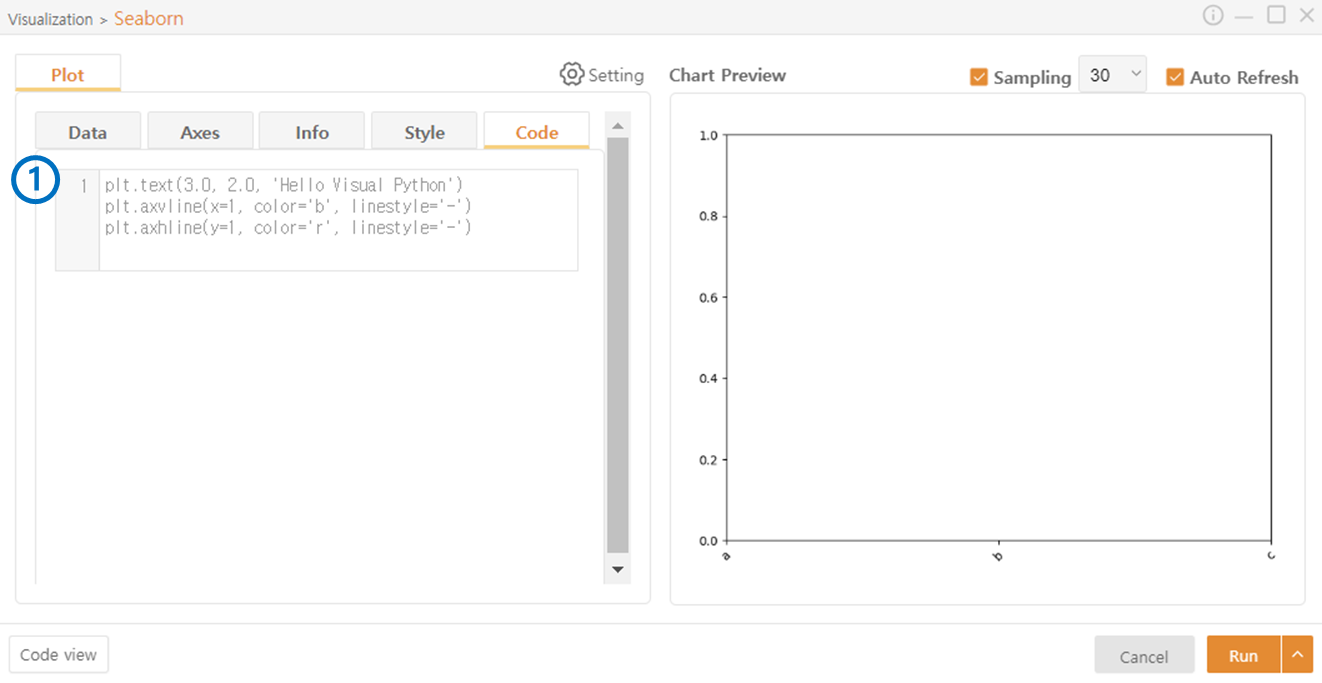
Code
Additional code beyond the functionalities provided by Visual Python can be added.
Last updated